TPL
Brand, Corporate IdentityToronto Public Library (TPL) is one of the largest public libraries in the world with over one hundred branches across the city. Their mission is to inform and inspire Torontonians through providing free access to their services and promoting human knowledge and information.
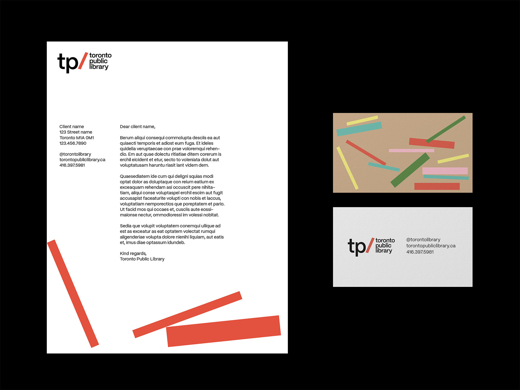
This brand refresh still strives to represent this mission, but emphasizes the organization as a resource in a more visually impactful (and playful) way.


Direction
Since TPL is a public-facing organization, it was important for the logo to remain friendly and accessible for this brand refresh. I approached this through maintaining its simplicity, use of lowercase from the original logo, and colours that are often used in education. The ‘L’ in TPL is slanted to imitate a book. I further explored the idea of books within the brand as well, with their scattered placements illustrating feelings of joy and playfulness. Audiences can expect to feel that with the many resources TPL provides them, they are truly opening doors to opportunities.
Since TPL is a public-facing organization, it was important for the logo to remain friendly and accessible for this brand refresh. I approached this through maintaining its simplicity, use of lowercase from the original logo, and colours that are often used in education. The ‘L’ in TPL is slanted to imitate a book. I further explored the idea of books within the brand as well, with their scattered placements illustrating feelings of joy and playfulness. Audiences can expect to feel that with the many resources TPL provides them, they are truly opening doors to opportunities.


